
 Written by Lyndon Hernandez, MD, MPH, FASGE, Chair of the GIE Editorial Review Board
What are the principles of creating an excellent graph? The statistician Edward Tufte asserts that not only should graphs “consist of complex ideas communicated with clarity, precision, and efficiency,” but more importantly it should also “consist of telling the truth about the data.” The problem is that we are too busy to read every manuscript in its entirety. At times, we glance at the title, go straight to the conclusion, look at the graphs, and make our own inferences. Graphs are often taken for granted as reliable sources of information, but sometimes it is inadvertently constructed to affirm the authors’ bias. As a reviewer, your role is to serve as filter against exaggerations of information. And checking the graphs is a good place to start.
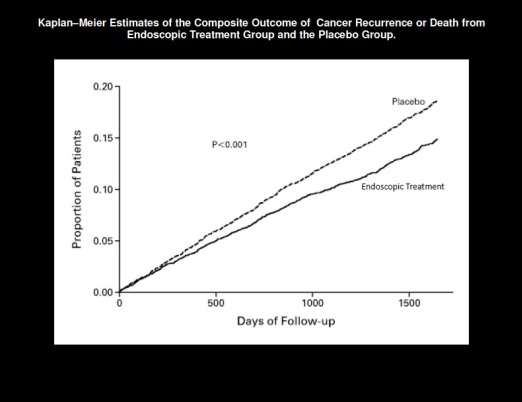
Problem: This Kaplan-Meier graph* is trying to convey a large difference between endoscopic treatment and placebo group. When you read the P-value <.001 and see the obvious split between the 2 lines, it is easy to conclude that endoscopic treatment is vastly superior to placebo. But remember that a significant P-value has very little to do with effect size. In addition, the y-axis (proportion of patients) was scaled too small to make the effect size appear much larger than what it really is. Most Kaplan-Meier graphs have y-axis scaled from zero to 100, or in this case zero to 1.0, to make it easier to interpret. If this graph was scaled in the conventional manner, the split between the 2 lines would be much less pronounced.
Solution: Look for key data presented in the usual format. Keep an open mind. Most authors are certainly not trying to deceive readers, but do give constructive comments to keep the data from being misrepresented.
* Published in a medical journal, modified with de-identified information.
